Curtis inquired in a comment on my last post about “Yes” and “No” being poor menu options. There are many UI design sources that suggest this, but I go as far as to say dialogs should never use Yes and No as options. OK is almost as bad unless it’s the only option. Why? People don’t read dialog boxes. This is how most users see dialog boxes:
If a user feels very cautious or isn’t used to computers they’ll read the dialog text, but most of the time they’ll read the buttons and choose the one that’s the default, unless the other seems more appropriate.
David Chisnall gives a particularly bad example:
When you put your card in a cash machine, you’re presented with a long question, and two options: Yes or No. You need to read this question every time, because sometimes it asks if you want the UI in English, and sometimes if you want it in Welsh. … If the options were “English” and “Welsh,” you could completely ignore the question and skip to the right button immediately.
Windows software is particularly bad for the Yes/No problem, but even MSDN says:
Prefer specific responses over Yes and No buttons. While there’s nothing wrong with using Yes and No, specific responses can be understood more quickly, resulting in efficient decision making.
Yes and No are terrible because their meaning is easily swapped. If you use verbs for your options, this can’t happen. You can’t rewrite a dialog’s text so that the meanings of Cancel and Continue are reversed.
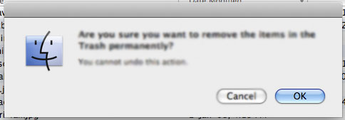
Even better are verbs that use the user’s language. OS X “Are you sure?” dialogs do this, giving the options “Save” and “Don’t Save”. The user likely wants to save, but they’re unlikely to be hankering for some yessing.