July 27 2012

A Monster in the lab

Steam Clock traditionally keeps its products under wraps until they’re ready to buy. For this year’s new app, I’m going to share the process, hopefully getting some good feedback along the way.

What to build?

In v2 of our Wedding DJ app, we really want great request management. Queuing, skipping, and reordering songs needs to be extremely easy to use, so you can get back to the party and not accidentally put everything to a screeching halt. The more we discussed this feature though, the more we wanted it as just a standalone app.

There are a ton of things the default iOS music player can’t do well:

  • I want to hear this next.
  • I want to hear a certain song, and then continue a certain playlist.
  • I want to look through what’s coming up, and veto certain songs.
  • I want to skip or pause this song, but have it fade the transition.
  • I want my songs to crossfade.
  • I want to queue up a few songs, and then let it ride.

So what we want is a simple queuing music player that crossfades and is very quick to operate. It would shine brightest at a party, where curation and avoiding a sudden stop is most important. As a matter of fact, it could serve as a drop-in replacement for WeddingDJ for some weddings. Another awesome use case is road trips, with the passenger curating the tunes.

For now, we’re calling it Party Monster. I’m not sure, but I suspect this is an awesome name.

What does it look like?

Almost immediately, I get to paper sketching. I’ll usually sketch a couple dozen versions of an app’s main screen, and roughly sketch some of the other screens. A lot of my sketching time is actually spent going back and forth with the team, pitching things. Well, more often I pitch removing things. “What if we take out reordering songs?” “What if there’s no explicit skip button?” “Is audio playback strictly necessary? Okay, fine.”

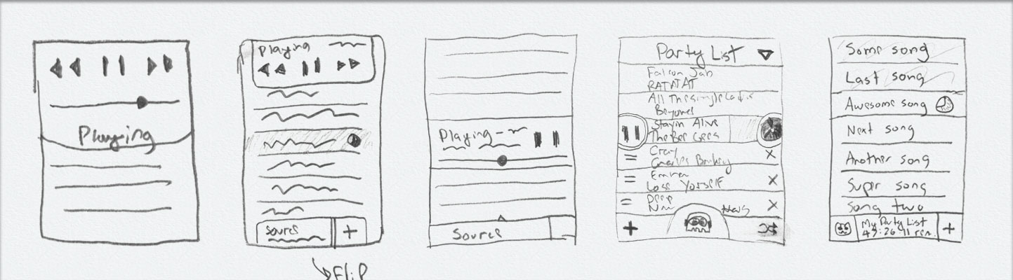
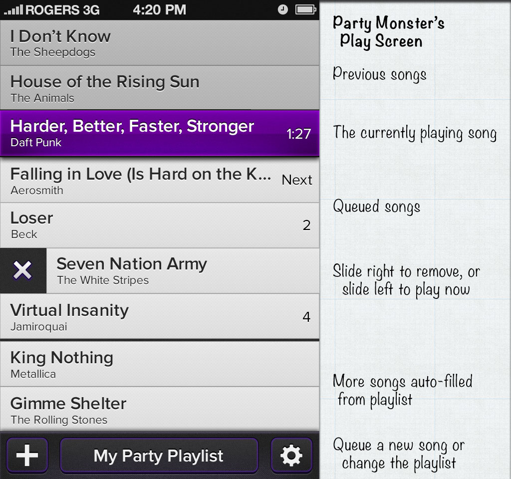
The starting point is iTunes’ Party Shuffle behaviour: fill the list of songs from a playlist, and allow the user to queue more songs below the play head. From there, we trim the fat and stir in some unicorn dust.

We managed to rid ourselves of almost every button, including play, pause, and skip. For a personal music player you often skip many times in a row, but for a DJ player like this you usually jump to a specific other song, and almost never go backwards. And so, we adopted Clear.app‘s delightful pull-to-act approach. A lot of swipe-to-act implementations suck because they either don’t give enough feedback that you’re on the right track (Tweetbot’s swipe on tweets is like this) or they reveal more buttons, making the task very slow. Clear’s behaviour is more like a sideways pull-to-trigger behaviour, and it’s a joy to use.

In Party Monster you pull a song one way to play, and the other way to ditch an upcoming song. If you forget this, you can always tap a row and it’ll bounce to indicate you can pull it – like Apple’s home screen Camera button. All this together makes for very quick operation and no accidental skips or pauses. Or, so we think – none of this has even been prototyped yet!

Now make it pretty

It takes iteration to get mockups looking good in Photoshop, and then many roundtrips through xScope Mirror to get the look right on the actual device. In the case of Party Monster, on-device testing showed that the tap targets needed to be bigger, the dark theme had to go, and that my color calibration between Photoshop and the iPhone is not even close.

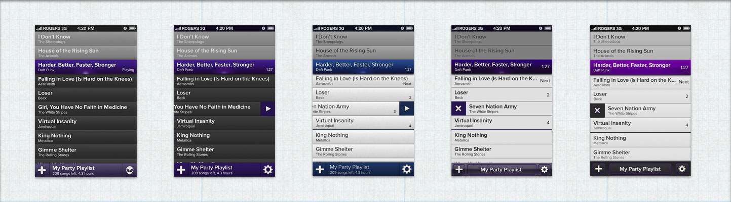
Just like the name Party Monster, the choice of purple was kind of random, but it stuck and people seem to really like it.

Now all you need to do is build it

The mockups are good enough that we can start showing them to people, and feedback so far has been good. We have lots of work left: upgrading WeddingDJ’s audio engine for the new features we want to add, building out the UI for Party Monster, and writing all the nice animations and effects we have planned.


So, what do you think? Is this something you’d buy for $1.99 on the App Store, and if so, what aspect you most interested in? What do you think of the design? Are we completely insane?

Updated Dec 5, 2012: Party Monster is now live on the App Store!

Related Posts

11 Comments

  1. mx
    Jul 27 2012
    8:58 am

    My interest is certainly piqued, I’d probably buy it just to see if it works any better for me. The features and design looks reasonable enough that I’d try it.

    And, the deep purple is a fun skeuomorphic irony.

  2. Allen
    Jul 27 2012
    8:59 am

    Haha, awesome. I didn’t even think of it as “deep” purple, but that is now the official colour name.

  3. Evan
    Jul 27 2012
    9:10 am

    love it.

    would love even more a version that acted like a remote to my appletv or other iTunes library.

  4. Dan
    Jul 27 2012
    9:10 am

    It’s a little on the busy side.

    Is there a chance you could move the previously-played to a separate screen, and blow up the current song with album art and other extended info?

  5. Allen
    Jul 27 2012
    9:31 am

    Thanks Evan – I don’t think Apple would approve us reverse-engineering that, but one Party Monster could potentially control another.

    Dan: Could you go into more detail about why you want to see more info about the current song? It drives me crazy how every other music player does this, and Apple’s players are the worst (entire screen on iPad showing just the album cover, what the fuck Apple.)

    Put another way, you’re running a party, and a song is on. Why are you looking at the album art?

  6. Curtis
    Jul 27 2012
    11:12 am

    Crossfade <3

  7. Jen
    Jul 27 2012
    11:13 am

    +1 to showing album art, but as an nxn icon to the left of the songs (where n is the current height of the line). Perhaps tapping on that would expand a little info card for the song, tap again to minimize.

    Both swiping either left or right should remove the song (and get rid of the X icon). Simply tap it to play now. You should always be able to drag songs around in the playlist, even if they’re currently playing.

  8. Allen
    Jul 27 2012
    11:38 am

    Jen: Thanks for the feedback!

    I’m open to album art thumbnails on songs, especially on the iPad version. Drag to reorder (after a tap and hold to distinguish from scrolling) is a must, although I hadn’t thought about what happens when you drag the currently playing song, UI wise. Seems crazy enough to work.

    The X icon only appears while you’re swiping to indicate what’s happening when you swipe. I originally pitched tap-to-play, but we decided there would be too many accidental play actions that were intended to be drags or removes.

  9. Jen
    Jul 27 2012
    12:18 pm

    I think tap to play could still work as long as you had appropriate algorithms in place so it only triggers when there is clear user intent (e.g. touch-down-time < x && distance-moved = y would be dragging and a longer press would be… probably nothing. Maybe show the info card.

    When you drag the current playing song it would look the same as it currently does (with the deep purple colour and, presumably, the timer ticking down). If you were to swipe away the currently playing song it would start playing the next song in the queue, probably without a fade-in/out since it’s an abrupt action.

    Android has ‘swipe to dismiss’ for notifications in the notification bar, for apps in the app switcher, and for removing tabs in Chrome. I cringe at the thought of having different behaviour for different directions of swiping and requiring people to remember which is which.

  10. Allen
    Jul 27 2012
    12:35 pm

    I originally thought that having each direction do something different was dangerous, but with the right feedback the way Clear.app does it, it turns out to be really usable. I suggest trying it out if you haven’t.

    Quite right with dragging the current playing song and swiping it, other than that during a party you never want a fadeless interruption. My main concern is around the edge cases (what happens if the song starts to end while you’re dragging it, etc)

    About tap-to-play: there are so many reasons to tap the screen (scroll, tap and hold to drag, swipe to remove, hit the status bar to scroll to top, hit the toolbar buttons at the bottom, just holding the device but accidentally tapping) that unintentional single-taps are inevitable.

    The question is, what’s worse – playing a song taking more thought, or sometimes playing a song unintentionally? In a party situation, switching to a different song is a pretty high-impact operation, so even if 9 out of 10 times your single-taps were meant to be Play Now, that’s not enough. For some parties (a wedding) even 99 times out of 100 might not be enough. For other uses (a road trip) then 9 times out of 10 is probably fine. It’s particularly problematic if you’re deleting 20 crappy songs from the list, and then suddenly you’ve triggered one of those crappy songs to play.

    When considering how hard to make an accidental play, we have to consider how easy it is to undo. If the new song finishes fading in before you cancel it by tapping the old song, there is no way to recover other than maybe starting the old song from the beginning.

    All that said, it’ll definitely need user testing. Even if it is practical, I worry it might hurt people’s brains too much.

  11. Pingback Shipping Party Monster - Allen Pike
    Nov 25 2012
    5:27 pm

    [...] months ago, I shared visual mockups of our upcoming app called Party Monster. A few days after that, we had a working prototype. Four months later, we submitted to the App [...]

What do you think?